---
title: CSS Style Images
description: "> Learn how to style images using CSS. ## Rounded Images Use the `border-radius` property to create rounded images: 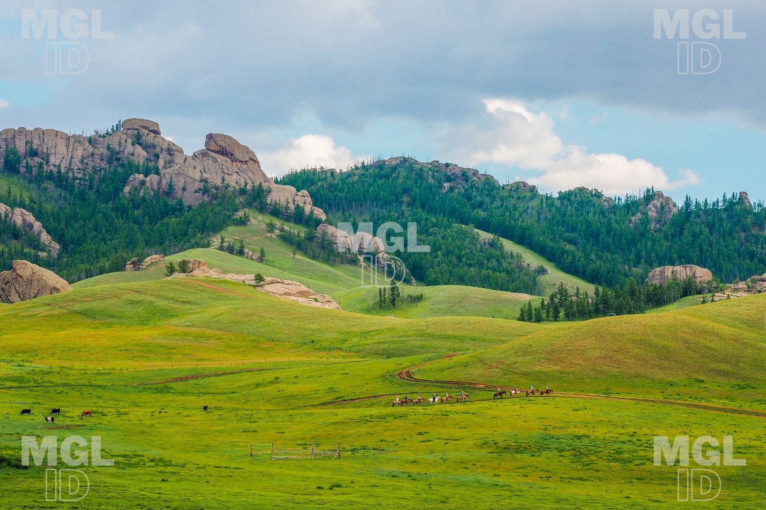 `img { border-radius: 50%; }`  `img { border-radius: 8px; }` ## Thumbnail Images Use the `border` property to create thumbnail images. Thumbnail Image:…"
url: "https://apprentice.mn/docs/css-style-images/"
updated: "2021-05-12"
category: CSS
---
# CSS Style Images
> Learn how to style images using CSS.
## Rounded Images
Use the `border-radius` property to create rounded images:
 `img {
border-radius: 50%;
}`  `img {
border-radius: 8px;
}`
## Thumbnail Images
Use the `border` property to create thumbnail images.
Thumbnail Image:
 `img {
border: 1px solid #ddd;
border-radius: 4px;
padding: 5px;
width: 150px;
}
 `
Thumbnail Image as Link:
[](https://mgl-bucket.s3.eu-central-1.amazonaws.com/mgl/59.jpg) `border: 1px solid #ddd;
border-radius: 4px;
padding: 5px;
width: 150px;
}
img:hover {
box-shadow: 0 0 2px 1px rgba(0, 140, 186, 0.5);
}
`
## Responsive Images
Responsive images will automatically adjust to fit the size of the screen.
Resize the browser window to see the effect:
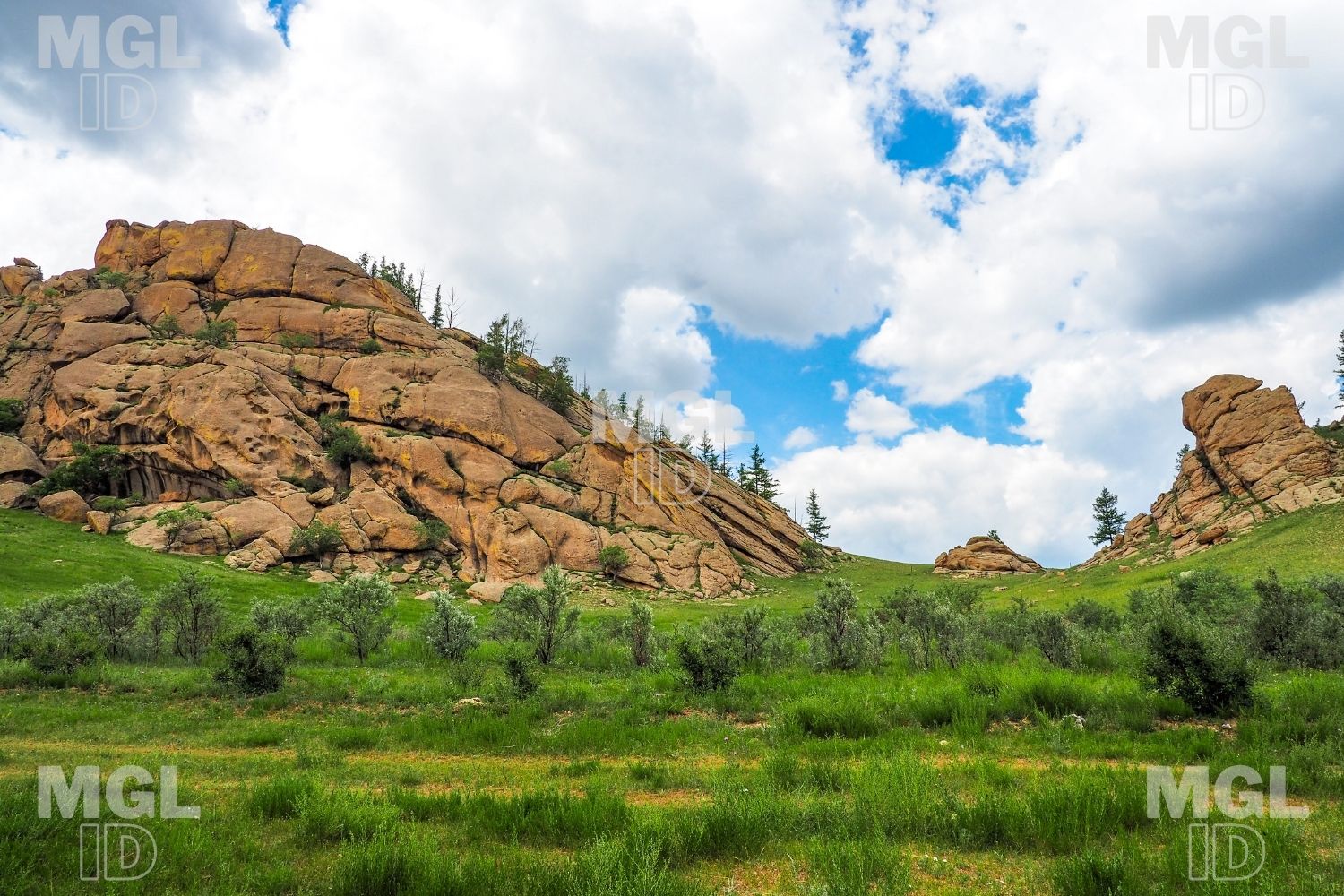 `img {
max-width: 100%;
height: auto;
}`
## Center an Image
To center an image, set left and right margin to `auto` and make it into a `block` element:
 `img {
display: block;
margin-left: auto;
margin-right: auto;
width: 50%;
}`
Lorem ipsum dolor sit amet, consectetur adipiscing elit. Ut elit tellus, luctus nec ullamcorper mattis, pulvinar dapibus leo.
## Responsive Polaroid Images / Cards

GER

Nature
`div.polaroid {
width: 80%;
background-color: white;
box-shadow: 0 4px 8px 0 rgba(0, 0, 0, 0.2), 0 6px 20px 0 rgba(0, 0, 0, 0.19);
}
img {width: 100%}
div.container {
text-align: center;
padding: 10px 20px;
}`
## Transparent Image
The `opacity` property can take a value from 0.0 – 1.0. The lower value, the more transparent:
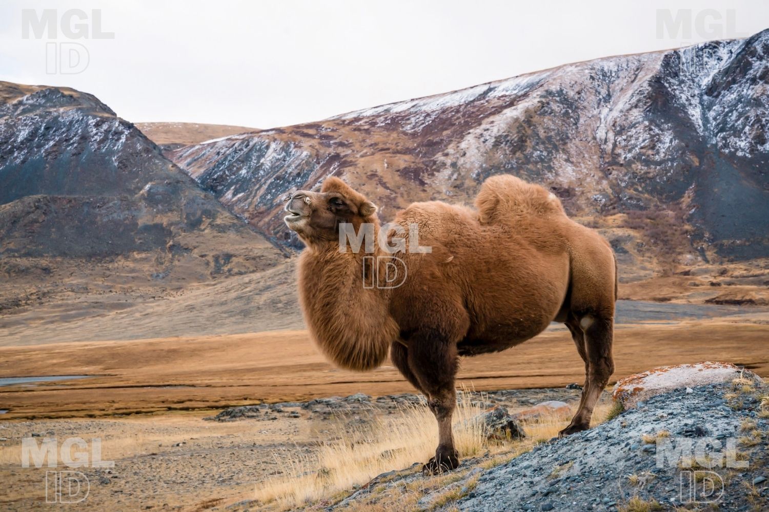
opacity 0.2

opacity 0.5

opacity 1
(default)
`img {
opacity: 0.5;
}`
## Image Text
How to position text in an image:
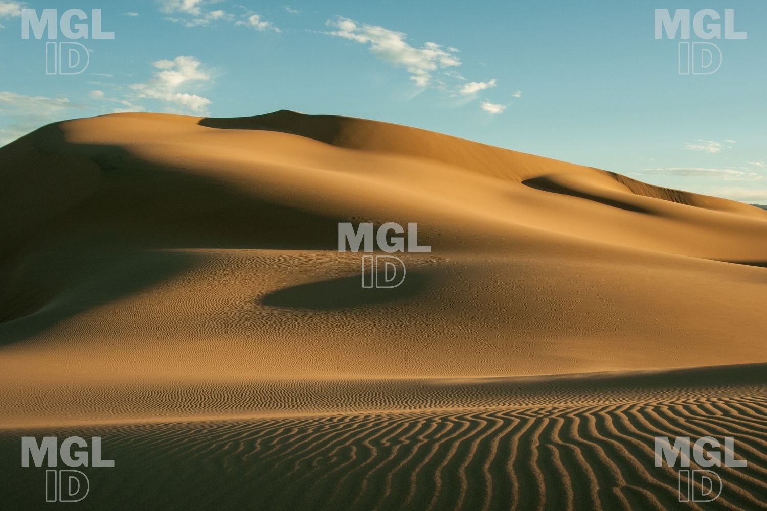 Bottom Left Top Left Top Right Bottom Right Centered
## Image Filters
The CSS `filter` property adds visual effects (like blur and saturation) to an element.
**Note:** The filter property is not supported in Internet Explorer or Edge 12.
### Example
Change the color of all images to black and white (100% gray):
`img {
filter: grayscale(100%);
}`
**Note:** The filter property is not supported in Internet Explorer or Edge 12.
**Note:** The filter property is not supported in Internet Explorer or Edge 12.
          
## Image Hover Overlay
Create an overlay effect on hover:
### Example
Fade in text:
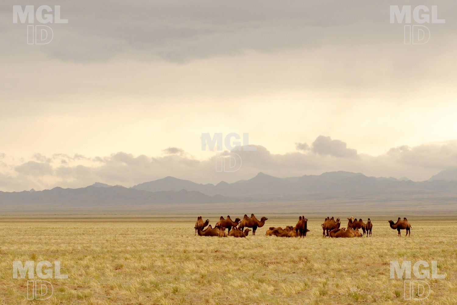 Hello World
## Fade in a Box
 Camels
## Slide in Overlay from the Top
 Hello World
## Slide in Overlay from the Bottom
 Hello World
## Slide in Overlay from the Left
 Hello World
## Slide in Overlay from the Right
 Hello World
## Flip an Image
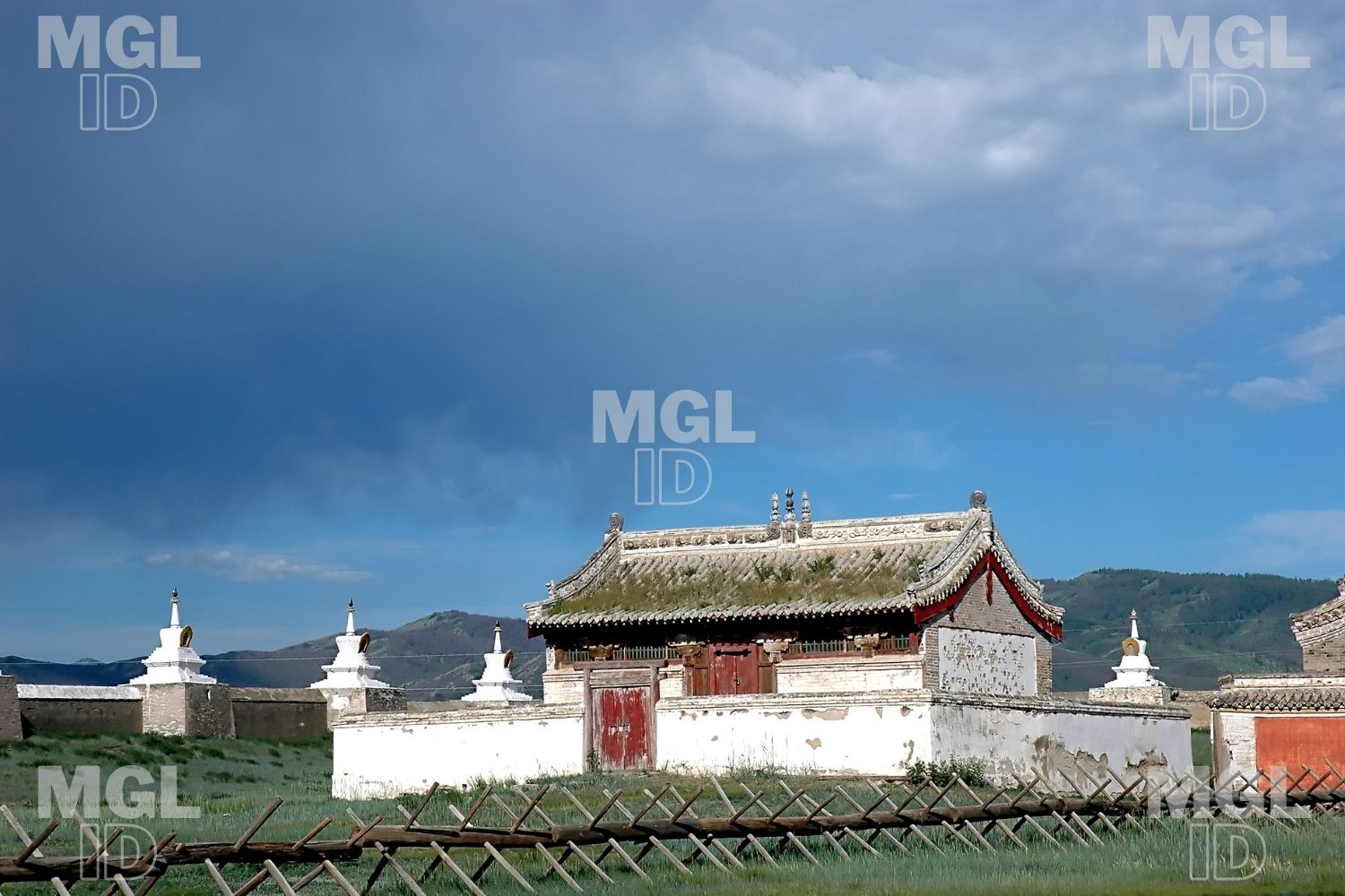
Move your mouse over the image:
## Responsive Image Gallery
CSS can be used to create image galleries. This example use media queries to re-arrange the images on different screen sizes. Resize the browser window to see the effect:
[](https://mgl-bucket.s3.eu-central-1.amazonaws.com/mgl/19.jpg) Add a description of the image here [](https://mgl-bucket.s3.eu-central-1.amazonaws.com/mgl/17.jpg) Add a description of the image here [](https://mgl-bucket.s3.eu-central-1.amazonaws.com/mgl/18.jpg) Add a description of the image here [](https://mgl-bucket.s3.eu-central-1.amazonaws.com/mgl/20.jpg) Add a description of the image here `.responsive {
padding: 0 6px;
float: left;
width: 24.99999%;
}
@media only screen and (max-width: 700px){
.responsive {
width: 49.99999%;
margin: 6px 0;
}
}
@media only screen and (max-width: 500px){
.responsive {
width: 100%;
}
}`
## Image Modal (Advanced)
This is an example to demonstrate how CSS and JavaScript can work together.
First, use CSS to create a modal window (dialog box), and hide it by default.
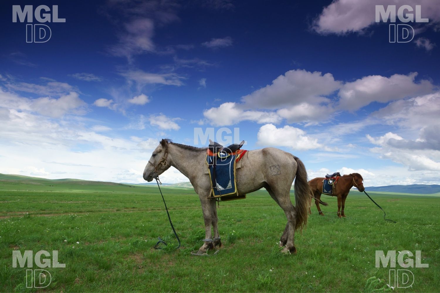
Then, use a JavaScript to show the modal window and to display the image inside the modal, when a user clicks on the image:
 × [https://www.addtoany.com/add_to/facebook?linkurl=https%3A%2F%2Fapprentice.mn%2Fdocs%2Fcss-style-images%2F&linkname=CSS%20Style%20Images](https://www.addtoany.com/add_to/facebook?linkurl=https%3A%2F%2Fapprentice.mn%2Fdocs%2Fcss-style-images%2F&linkname=CSS%20Style%20Images)[https://www.addtoany.com/add_to/mastodon?linkurl=https%3A%2F%2Fapprentice.mn%2Fdocs%2Fcss-style-images%2F&linkname=CSS%20Style%20Images](https://www.addtoany.com/add_to/mastodon?linkurl=https%3A%2F%2Fapprentice.mn%2Fdocs%2Fcss-style-images%2F&linkname=CSS%20Style%20Images)[https://www.addtoany.com/add_to/email?linkurl=https%3A%2F%2Fapprentice.mn%2Fdocs%2Fcss-style-images%2F&linkname=CSS%20Style%20Images](https://www.addtoany.com/add_to/email?linkurl=https%3A%2F%2Fapprentice.mn%2Fdocs%2Fcss-style-images%2F&linkname=CSS%20Style%20Images)[https://www.addtoany.com/share](https://www.addtoany.com/share)
`
Thumbnail Image as Link:
[](https://mgl-bucket.s3.eu-central-1.amazonaws.com/mgl/59.jpg) `border: 1px solid #ddd;
border-radius: 4px;
padding: 5px;
width: 150px;
}
img:hover {
box-shadow: 0 0 2px 1px rgba(0, 140, 186, 0.5);
}
`
## Responsive Images
Responsive images will automatically adjust to fit the size of the screen.
Resize the browser window to see the effect:
 `img {
max-width: 100%;
height: auto;
}`
## Center an Image
To center an image, set left and right margin to `auto` and make it into a `block` element:
 `img {
display: block;
margin-left: auto;
margin-right: auto;
width: 50%;
}`
Lorem ipsum dolor sit amet, consectetur adipiscing elit. Ut elit tellus, luctus nec ullamcorper mattis, pulvinar dapibus leo.
## Responsive Polaroid Images / Cards

GER

Nature
`div.polaroid {
width: 80%;
background-color: white;
box-shadow: 0 4px 8px 0 rgba(0, 0, 0, 0.2), 0 6px 20px 0 rgba(0, 0, 0, 0.19);
}
img {width: 100%}
div.container {
text-align: center;
padding: 10px 20px;
}`
## Transparent Image
The `opacity` property can take a value from 0.0 – 1.0. The lower value, the more transparent:

opacity 0.2

opacity 0.5

opacity 1
(default)
`img {
opacity: 0.5;
}`
## Image Text
How to position text in an image:
 Bottom Left Top Left Top Right Bottom Right Centered
## Image Filters
The CSS `filter` property adds visual effects (like blur and saturation) to an element.
**Note:** The filter property is not supported in Internet Explorer or Edge 12.
### Example
Change the color of all images to black and white (100% gray):
`img {
filter: grayscale(100%);
}`
**Note:** The filter property is not supported in Internet Explorer or Edge 12.
**Note:** The filter property is not supported in Internet Explorer or Edge 12.
          
## Image Hover Overlay
Create an overlay effect on hover:
### Example
Fade in text:
 Hello World
## Fade in a Box
 Camels
## Slide in Overlay from the Top
 Hello World
## Slide in Overlay from the Bottom
 Hello World
## Slide in Overlay from the Left
 Hello World
## Slide in Overlay from the Right
 Hello World
## Flip an Image
Move your mouse over the image:

## Responsive Image Gallery
CSS can be used to create image galleries. This example use media queries to re-arrange the images on different screen sizes. Resize the browser window to see the effect:
[](https://mgl-bucket.s3.eu-central-1.amazonaws.com/mgl/19.jpg) Add a description of the image here [](https://mgl-bucket.s3.eu-central-1.amazonaws.com/mgl/17.jpg) Add a description of the image here [](https://mgl-bucket.s3.eu-central-1.amazonaws.com/mgl/18.jpg) Add a description of the image here [](https://mgl-bucket.s3.eu-central-1.amazonaws.com/mgl/20.jpg) Add a description of the image here `.responsive {
padding: 0 6px;
float: left;
width: 24.99999%;
}
@media only screen and (max-width: 700px){
.responsive {
width: 49.99999%;
margin: 6px 0;
}
}
@media only screen and (max-width: 500px){
.responsive {
width: 100%;
}
}`
## Image Modal (Advanced)
This is an example to demonstrate how CSS and JavaScript can work together.
First, use CSS to create a modal window (dialog box), and hide it by default.
Then, use a JavaScript to show the modal window and to display the image inside the modal, when a user clicks on the image:
 × [https://www.addtoany.com/add_to/facebook?linkurl=https%3A%2F%2Fapprentice.mn%2Fdocs%2Fcss-style-images%2F&linkname=CSS%20Style%20Images](https://www.addtoany.com/add_to/facebook?linkurl=https%3A%2F%2Fapprentice.mn%2Fdocs%2Fcss-style-images%2F&linkname=CSS%20Style%20Images)[https://www.addtoany.com/add_to/mastodon?linkurl=https%3A%2F%2Fapprentice.mn%2Fdocs%2Fcss-style-images%2F&linkname=CSS%20Style%20Images](https://www.addtoany.com/add_to/mastodon?linkurl=https%3A%2F%2Fapprentice.mn%2Fdocs%2Fcss-style-images%2F&linkname=CSS%20Style%20Images)[https://www.addtoany.com/add_to/email?linkurl=https%3A%2F%2Fapprentice.mn%2Fdocs%2Fcss-style-images%2F&linkname=CSS%20Style%20Images](https://www.addtoany.com/add_to/email?linkurl=https%3A%2F%2Fapprentice.mn%2Fdocs%2Fcss-style-images%2F&linkname=CSS%20Style%20Images)[https://www.addtoany.com/share](https://www.addtoany.com/share)