| Property |
Description |
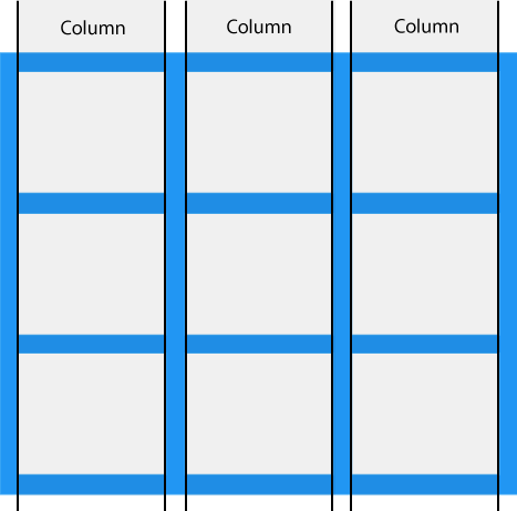
| column-gap |
Specifies the gap between the columns |
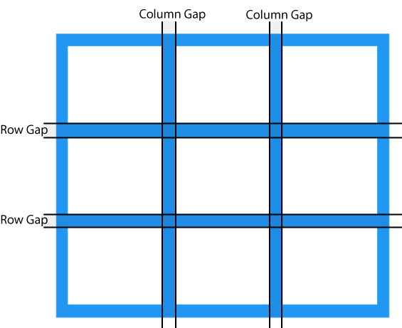
| gap |
A shorthand property for the row-gap and the column-gap properties |
| grid |
A shorthand property for the grid-template-rows, grid-template-columns, grid-template-areas, grid-auto-rows, grid-auto-columns, and the grid-auto-flow properties |
| grid-area |
Either specifies a name for the grid item, or this property is a shorthand property for the grid-row-start, grid-column-start, grid-row-end, and grid-column-end properties |
| grid-auto-columns |
Specifies a default column size |
| grid-auto-flow |
Specifies how auto-placed items are inserted in the grid |
| grid-auto-rows |
Specifies a default row size |
| grid-column |
A shorthand property for the grid-column-start and the grid-column-end properties |
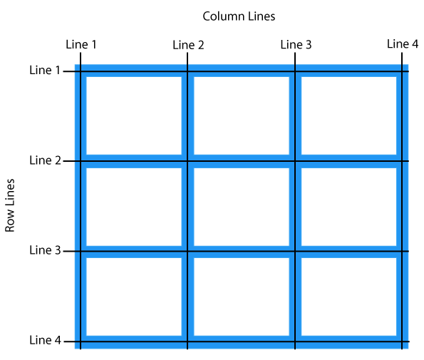
| grid-column-end |
Specifies where to end the grid item |
| grid-column-gap |
Specifies the size of the gap between columns |
| grid-column-start |
Specifies where to start the grid item |
| grid-gap |
A shorthand property for the grid-row-gap and grid-column-gap properties |
| grid-row |
A shorthand property for the grid-row-start and the grid-row-end properties |
| grid-row-end |
Specifies where to end the grid item |
| grid-row-gap |
Specifies the size of the gap between rows |
| grid-row-start |
Specifies where to start the grid item |
| grid-template |
A shorthand property for the grid-template-rows, grid-template-columns and grid-areas properties |
| grid-template-areas |
Specifies how to display columns and rows, using named grid items |
| grid-template-columns |
Specifies the size of the columns, and how many columns in a grid layout |
| grid-template-rows |
Specifies the size of the rows in a grid layout |
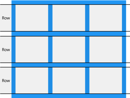
| row-gap |
Specifies the gap between the grid rows |